My Debt Payoff Journey Infographic
Today I’m releasing a new premium feature that I’ve wanted to add for a long time. I’m a big fan of infographics, so I thought it would be cool to have a dynamic infographic for your debt payoff progress so you can save or print it or whatever. I’m calling it My Debt Payoff Journey and it will update its’ info whenever you make any changes. Check it out and let me know if you have any design or content ideas for this. I plan on adding and changing it around as time goes on. This has its’ own menu item on the left and is available now to Undebt.it+ members.

my debt payoff journey
Love it. Would be cool to see how much interest I was paying per month at the start vs now.
That’s a good idea
This is very cool, where and how do I use it? I
This page is part of the Undebt.it+ premium account. There is a free trial you can turn on if you want to see it in action. The page itself is located here: https://undebt.it/payoff-journey.php
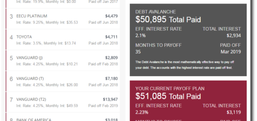
How are the top 5 determined?
The top 5 in your payoff order
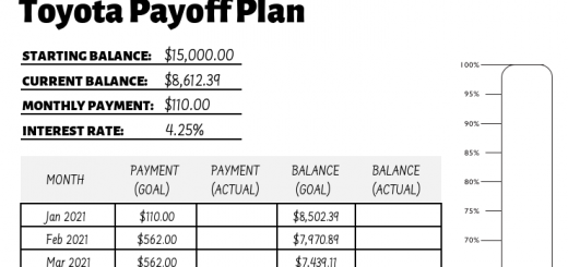
Great feature, if it displayed correctly, What is the math behind it?
The same math as what the website. Is it not working for you?
Is it realtime? I have refreshed browser and even cleared browser and did a fresh load and never moved from 67%. I have paid off several this month never moved. Also after I deleted an account not included in payoff plan it went down to 1.8% so wasn’t sure on what formula was used to calculate
Yes, it’s realtime. If you’re seeing old info, it’s a browser caching issue. Try pressing shift + F5 to force a refresh.
Yes I tried that as well as clearing cache manually. Clearly its not a browser issue if it updated after I deleted an account.
Does this number include items not in payoff plan?
I don’t think it does. It should show the same numbers as what’s in the header