Undebt.it Version #4 Redesign Preview
Redesign Background
Over the past two months I’ve been hard at work developing the next version of Undebt.it and I’m happy to announce that it’s finally ready to go. Much of the feedback I’ve received had to do with streamlining & consolidating the pages and making it work even better on mobile devices so I’ve made those two areas the main focus of the redesign. The biggest design change in this version is the use of a “front-end” and “back-end” type design. What this means is there are two different themes in place, one for the general content, like the main page and How Undebt.it Works page and another theme for the guts of the site, like the Dashboard and Snowball Table pages. Of course, there’s also a new logo and color scheme too.
New Stuff on the Navbar
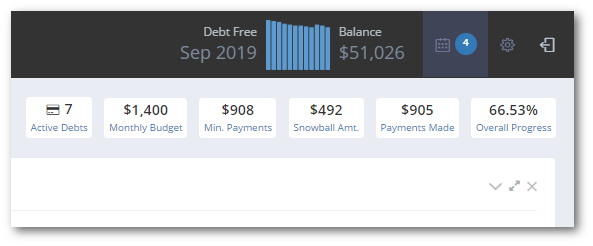
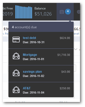
Here’s an example of the new statbar on the top of the navbar on the back-end pages. Much of the information is the same as the current site, but there are some cool, new features. The blue bars in the picture represent your total monthly balance for the last twelve months. You can quickly see how you’re doing overall with this graph. The other new feature is the calendar icon with the number in the circle. I call this the “quick look” and it shows you how many debts (& bills if you have it turned on) you have due within a week. There’s a similar looking pulldown on the front-end pages too.
Bonus Stuff on the Right Sidebar
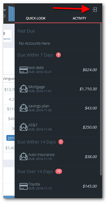
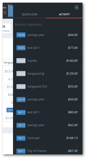
For the Undebt.it+ members, there’s also a quick look right-sidebar. At the far top-right of the screen, you’ll see a box with an arrow in it; this is the toggle for the right sidebar. The sidebar has two columns right now, one that shows you a complete list of your debts and bills grouped together by due date and the other column shows you a list of all of your recent transactions (paying debts & bills). Let me know if you have any ideas for more content on these menus.
Dashboard Changes
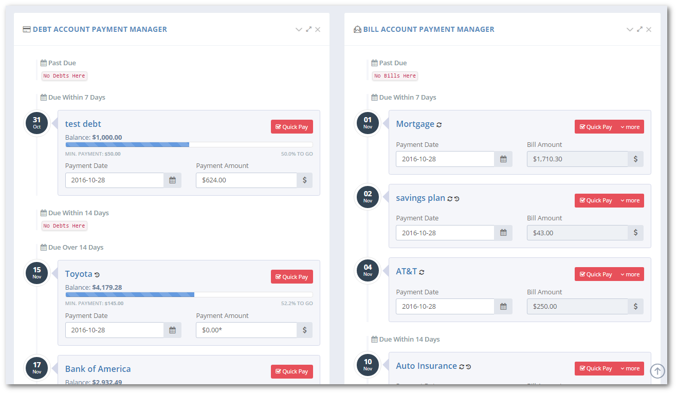
The main change is that it’s called the “Dashboard” instead of the “Debt Dashboard”. If you use the bill management module, you’ll see debts and bills combined onto one page rather their own dashboard. Note that the debt accounts are in due date “buckets” like the bills. I’m planning on making the buckets user-selectable in the future.
The Account List
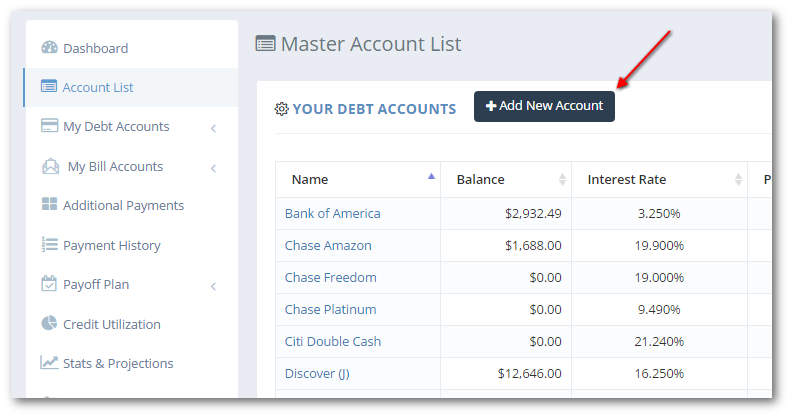
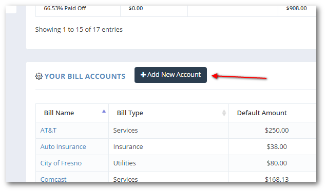
Like the Dashboard, the account list pages have been consolidated into one page. Debts & bills on the same page, easily add new accounts. Not much else new on this page.
Account Details
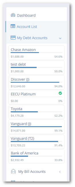
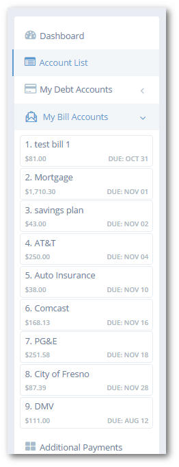
The left sidebar has some nice changes too. The debt account list shows the balance, amount due and payoff progress. Also note the green checkmark on one of the accounts – this indicates that the account was paid off this month. The bill list shows the amount due and due date.
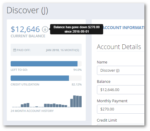
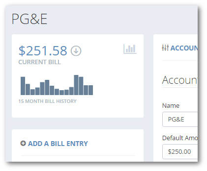
The details pages for debts and bills has been revamped to quickly show account history with an inline bar graph. The graph is an Undebt.it+ feature and shows a running monthly history of up to two years. The up/down arrows next to the account balance show if the balance has gone up versus last month. Hover your mouse over the arrow and you’ll see a popover message like the one below.
Wrapping it up
That just about covers all of the changes in the fourth generation of Undebt.it. I’m doing the final testing now and hope to have it all switched over this weekend. If you’d like to test it out, just use one of the contact forms or message me on social media. I hope you like all of the changes.



Amazing job.
Thanks!
Looks great Jeff!
Love, love, love the UI changes! What a great site. A few thoughts:
– I can’t find how/ where to manage the snowball amount anymore; I used to get to it from the left nav; is it still there?
– I like the Quick Pay feature; but had to go back and change all the assigned payment months because I haven’t logged in since late September
– Would be nice to just have a button to “make all scheduled monthly payments” with one click, assuming the planned amounts are the same, and assming you can select the paid month
– Love the payment calendar and payment manager
– Love the flyout menu in the nav
– Would like to be able to see previous months’ in the debt snowball table to see my progress
Keep up the awesome work!!
-the budget is set in the main settings area towards the bottom. I’ll probably add a settings pane to the right sidebar (premium accounts)
-The one-click payment is a good idea, I’ll look into that
Thanks for your feedback and ideas
Awesome – just one other thought; for the “What is your total budget?” text box seems to me, to be the crux of the entire application. I keep changing that to see how that impacts the Debt Payoff table, and have to either keep two tabs open or continously navigate back and forth through the nav and sub nav. I think there would be lots of value for users to quickly add / edit / slide the scale of what they want to plan on budgeting while on the Debt Snowball table view. This will allow users to quickly see the effects of the various amounts. Perhaps motivate a few like me to get more “gazelle” intense with penny-pinching seeing how much more quickly finding an extra $10 or $20 in our budgets can be applied long term to the debt snowball to make more of an impact.
Anyways – just a thought – would love the see that budgeting box closer to the debt table for easy analysis 🙂
Check it out now 🙂
Frigging fantastic!! Hope others will find that useful as well. Thank you 🙂
Heya Jeff!
I love it!! Can I just offer one suggestion? I liked the feature where you could click the payoff date in the header and it took you straight to the payoff plan table. Can you throw that in at some point?
Thank you!!
I’ll see if I can add a link to that text without it looking funny; but if you click on the “snowball amount” area right below that, it will take you to the same place. Thanks
Love the program only thing I would like to see added Would Be to have a place where it shows a total for your bills due for the month preferably on the stat bar.
Just want to say a million thanks for all the incredible work you put into this. It’s really a top notch product.