New Graphs & Interest Stats
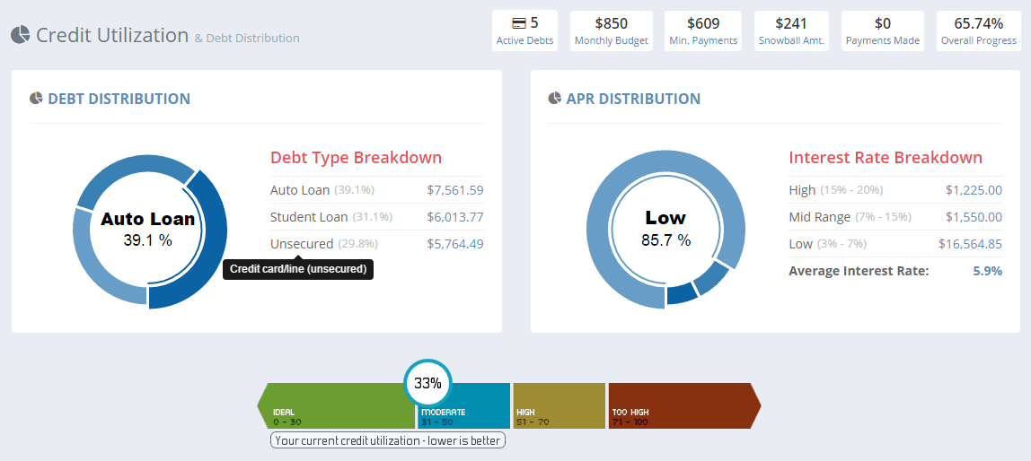
You’ll see some changes on the Credit Utilization page starting today. There are two new pie charts at the top of the page; one that breaks down your debt accounts by type and the other that breaks them down by interest rate. Also note on the APR Distribution chart, you can see your overall weighted average interest rate which I think is pretty important.
I have been wanting to add more visual components for some time and this is just the first piece that’s completed. I’m probably going to add a page dedicated to payoff progress and quick info like these graphs, so I’m putting these charts here for the time being. These graphs are part of the free/standard account. I’m always looking for more ideas so keep them coming – I hope you like it.


